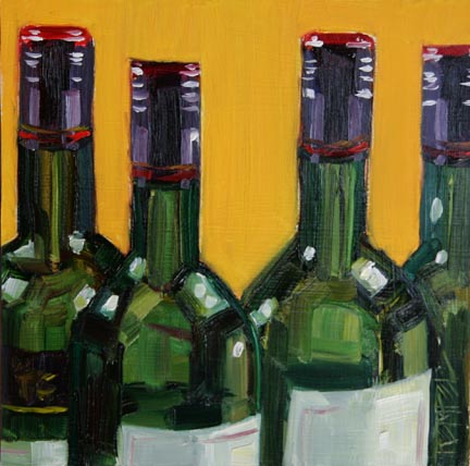
 When I lined up these bottles to paint it reminded me of a police line-up, hence the title. It made me laugh! I enjoy painting wine bottles - all those greens! I was moving fairly quickly, trying to keep things loose and snappy.
 6" x 6" / oil on panel / $75
22 comments:
What a fun painting, and I love the name - very clever.
Mmmmm... like this one, do you mind if I borrow this idea?
Nice painting Kim, the glass looks great! Like the title too.... Your pizza was a good one too!
Kim,
this makeup line is elegant and the colors are divine!
the reflection and glare so great!
good work! ;)
congrats!
kisses
Hi Kim,
It is loose and snappy, and delicious.
Great colour.
Wonderful.
Take care,
Barbara
This is great! You really captured the greens and the reflections.
What happened to the bottle you posted yesterday on DPO? I loved that painting!
Great title, and the bottles are fabulous. Just enough difference between them all in size, reflection, etc. to make them the same but different.
Thanks!
JanettMarie - no problem.
Virginia - The jar I posted on DPO was a painting I had previously posted on this blog (May 21). Maybe I should have run it again and just marked it a re-run. But thanks for telling me you liked it : )
Fun painting and love the title. The red, yellow orange and green are a great combo too. And tight cropping is always interesting. Congrats!
Love the painting and the clever title! Beautiful greens!
Nice title Kim. Very clever. I like this.
Great job with the bottles. The glass looks wonderful. I really like how you handled the transparency of the glass.
Love it Kim! And the title, you're just so dang clever :) Those greens are luscious!
Great title and great job with the bottles. Great greens.
You can almost read the expressions on their faces ! :)
The name made me laugh also. We have a wine over here made by monks. It is a fortified cheap and nasty wine favoured by drunks and teenagers so a line up of those bottles would have fitted the title even more. I laughed at this and then you made me consider .
Brilliant! I love the reflections of the windows in the bottles!
Great colors. Love that yellow background and the red, purple, green combo. Lots of energy. Stocking up for September? :-)
Wonderful handling of the green glass... really great title!
Your deft strokes have made these bottles so interesting.
Love this green and gold! Fantastic job on the glass. Witty title too!
The reason I really liked this painting is the brush strokes. It looks really deep. The colours are so interesting...can't wait to have it on my wall!
I can't believe that no one else has bought this painting!
Thanks Kim
Post a Comment