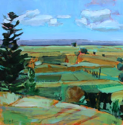
- detail -
- as it stands now -
- indicating what I need to figure out -
Post-script: Okay - I had just hit "publish" and then decided to show you what I was trying to figure out. I circled it with black. I think the two dark green shapes are too similar and to fix that up I am deciding whether to lighten/change the colour of the shape in the background or mix up the colours in the 3-section field (also circled). I think they need alterning anyhow... That's the only part of the piece that's bothering me: that 3-section field. Any critiques completely welcome!
Today was very similar to yesterday in that I went back to a clunky piece from spring that I couldn't stand to look at any more, and had at it. It felt good to simplify and just block stuff out. Actually I'm really digging the part I cropped off for the "detail" shot. Kind of wish that was my painting! But I really do like this one - just needs a few colour tweaks. In real life the sky has more interesting things going on/tonal shifts but somehow it was missed in translation.
Having a hard time doing my small works this week. Why? Not sure. I just want to work larger. And experiment. Work really large actually...maybe on the weekend. This is painted on the same wood box support as yesterdays. I believe it is 24" square.


14 comments:
I like the color variation in the 3 fields in front. But as color lightens as it recedes, maybe the one further back should be lighter in value. Go for the large!
I agree with Pam, lighten it a bit. I love the colors and the painting! Love your previous post also!!
Lo único que puedo decir es que me gusta mucho tu interpretación del paisaje. Me gustaría conseguir esto.
Un saludo.
I wouldn't have noticed unless you pointed it out - but now you have, yes I would lighten the distant field. It's going to be a gorgeous painting! :0)
I vote for lightening the value on the further field as well.
My last piece I just finished was a double the size I usually work on and I found it very liberating, so much room to play with, I say why not work larger for a spell.
Cheers
I would say leave the 3 color field as is and try
graying down and lightening the background shape you circled
Because it can be important in leading
Viewer's eye to the wonderful detail part that
You really like. Nice work!
I agree with everyone as well. Leave the 3 fields in the foreground and muck with that back one - it seems to pop forward instead of receding back. Nice painting though!
Hi Kim,
Ditto to what everyone else has said. I made up my own mind before I read what everyone else wrote and I, too, think you should lighten up the further field. I'm also wondering if you should ever-so-slightly lighten the dark tree/bush that cuts into your purple horizon line. Just a smidge- and I know you didn't ask about that area, but my eye keeps going to it. I love the sky, by the way, and the detail.
And hey, paint large if that is where your head is at. I love your big work.
Nicki
Kim....When painting en plein air the value problem will always be present as you work on one area at a time.
The Key is to work all around the surface... walk back about a dozen or so paces from time to time... and squint at your canvas through your eyelids.
That simple act will help you judge the values relative to one and other.
Aerial perpective: colours lighten and go to a blue phase as they recede to the horizon.
Good luck with it. Nice planes!that all of your friends are referring to in thgier comments.
Good Painting!
Warmest regards to you and Harry!
Bruce
love have these critiques! learned a lot!
you already knew what was suggested, but how great is it to
have confirmation! now, for my almost worthless comment~~~~I would choose another color altogether of the back "hole" not green. would love to see it dulled down grayed down.
The critiques offered are really helpful. I agree that the back plane needs a little work. Perhaps changing the shape and color with aerial perspective in mind. Love this painting. Hope you will let us see what you did if you decide to change it!
a beautiful painting!!!!!!!!!!!!!!
I really like the detail section as a distinct painting. But, to make the bigger painting incorporate it, I have a different idea than everyone else - maybe it would be nice to have a few more dark lines or shapes that extend out from around the tree into the farthest field, so that there is more of a zigzag pattern of darks. Maybe the left orange patch made darker or purple?Anyway, you are a very good painter, so trust your instincts!
I like what you ended up with. But I have to say - sometimes you want to paint big - or different - LISTEN to that inner voice! :) You rock...
Post a Comment